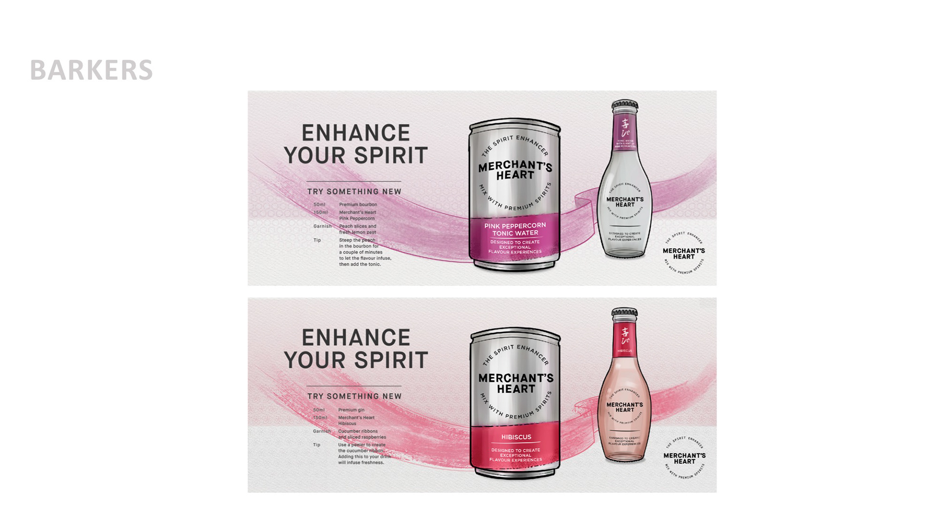
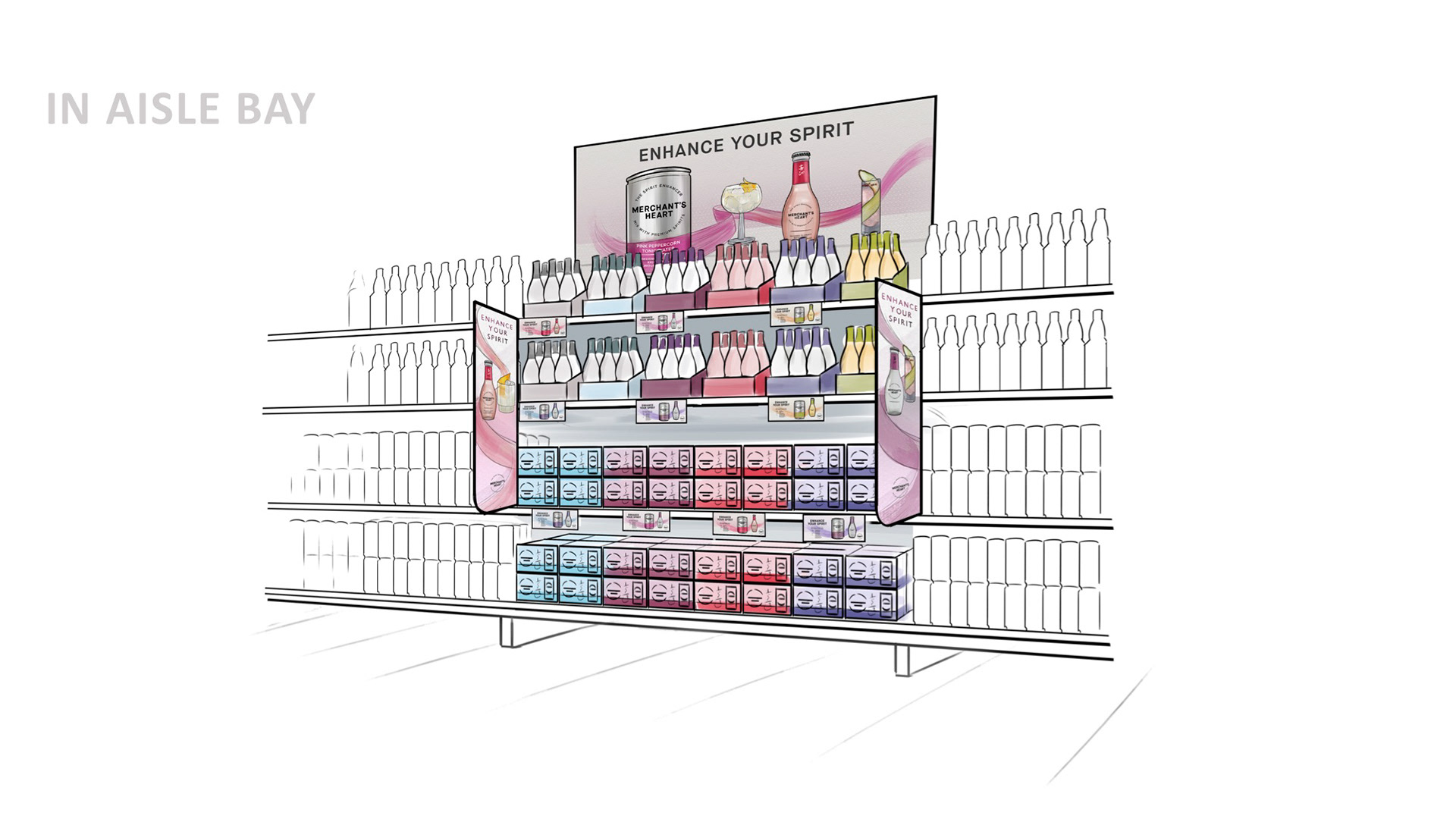
Merchant’s Heart is a premium spirit enhancer. It launched in 2017.
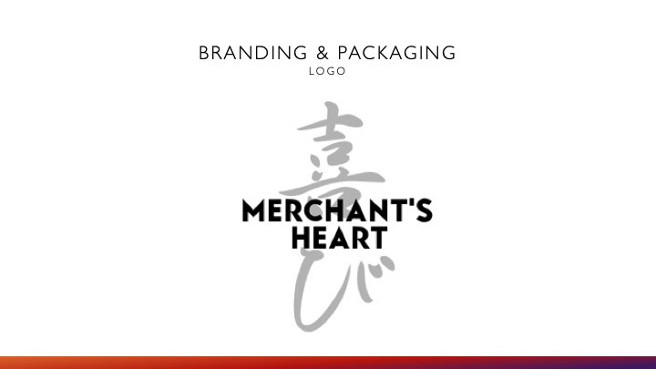
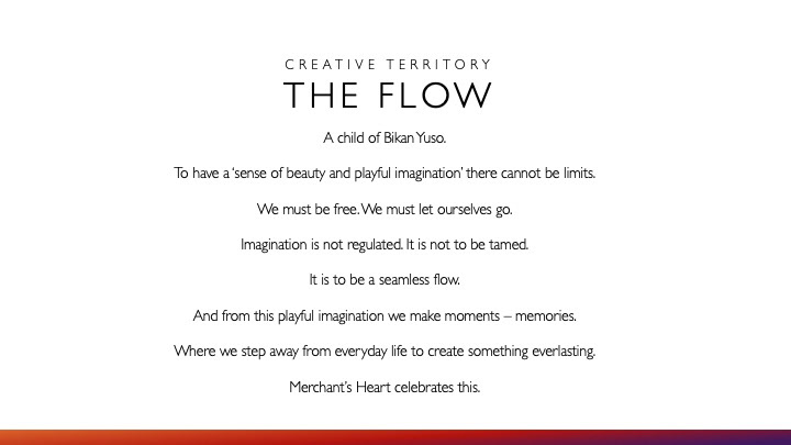
Working with senior designer Silv Leal, we were tasked to come up with a new creative platform to work under the brand’s proposition of ‘Bikan Yuso’, which translates from Japanese as 'To have a sense of beauty and playful imagination'.
When exploring Bikan Yuso, we came up with 'The Flow': To have a sense of beauty and playful imagination, you must let yourself go. There cannot be any restrictions. It is an endless flow.
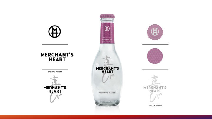
To visually represent The Flow, we chose the Japanese calligraphy style of Shuji and the Wagara patterns, each with its own meaning. Each flavour had its own Wagara and the pattern's meaning was linked to the flavour.
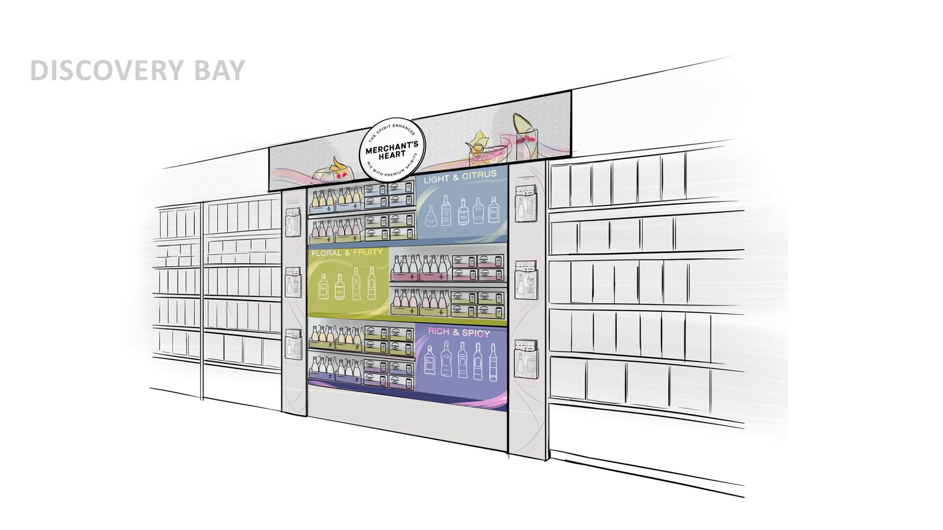
All of this work was completed for a push in Sainsbury's in August 2019. The slides below were taken from a client presentation.
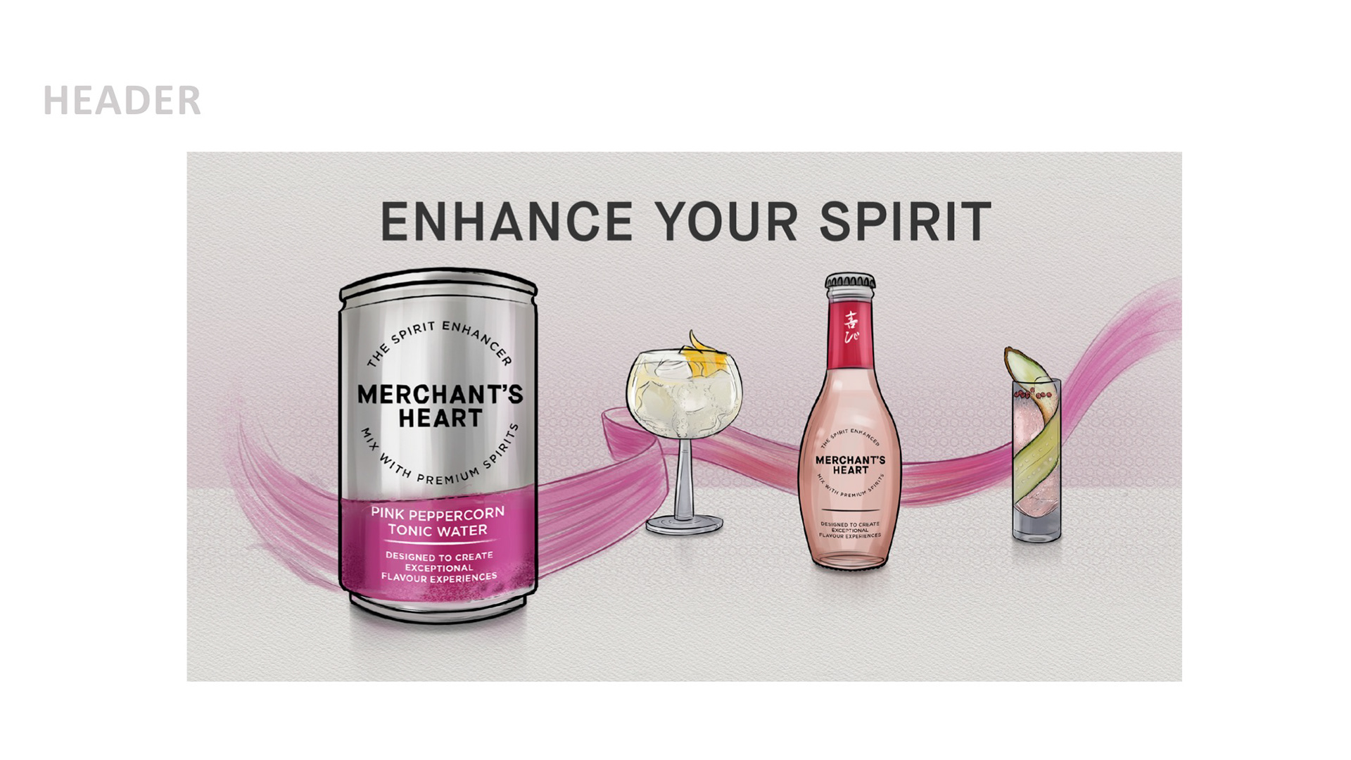
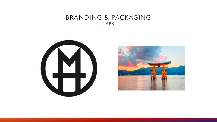
Along with designer Gray Cousins, we had a go at re-designing the logo and bottle.